Colour Trends: What’s so important about Sherwin Williams ‘Colour of the Year’?
Sherwin-Williams Colour of the Year 2021 is Urbane Bronze
Here’s what they say about it.
Rooted in Nature
“Nature at its simplest and most elemental — embodying the richness of the Earth’s stone, metal and wood — forges a feeling that’s grounded, meditative and serene. Announcing Urbane Bronze SW 7048, the 2021 Sherwin-Williams Color of the Year.”
Here’s what my colour expert friend Maria Killam says about it.
“I think it is a modern greyed-bronze colour that leans a bit green. It is a softer, warmer alternative to black without being too brown so it still feels current. A grey bronze is a colour I consider to be a fairly safe choice for uncertain times.
It is definitely a signal though, that black and charcoal are warming up a bit in the world of colour trends. We all need a bit of stability and comfort, and I can’t think of a more grounded colour.” I think Maria is right on the mark!
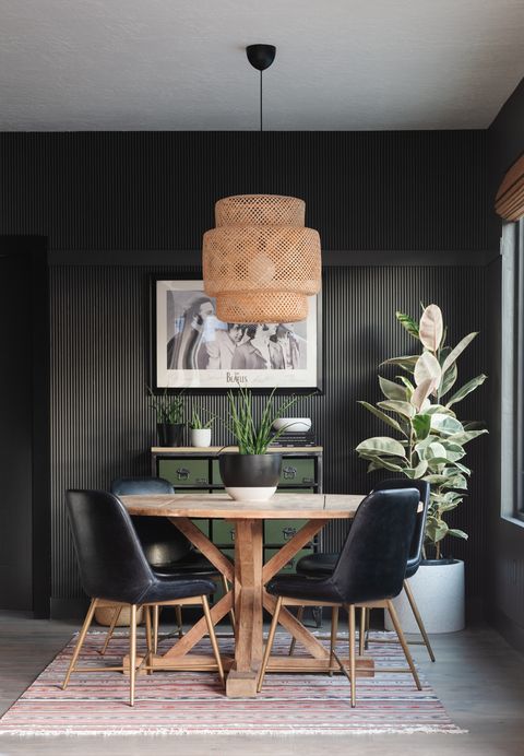
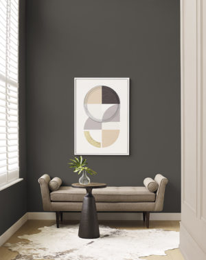
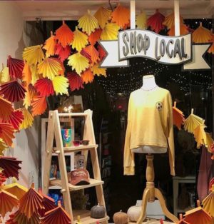
Below are some great examples of its use.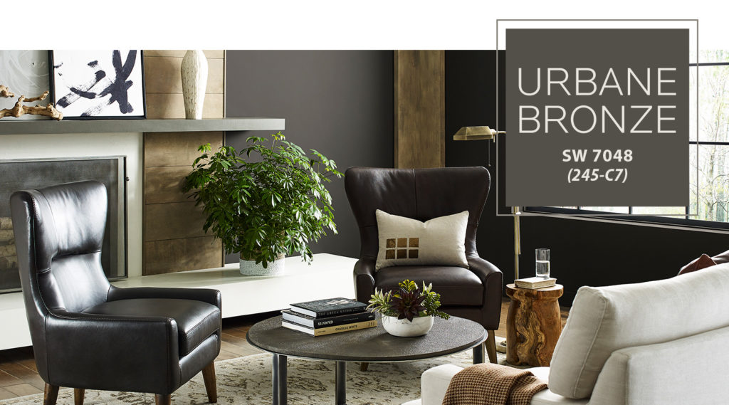
How are Colour Trends Decided?
Back in late March I was asked to be on an international colour marketing group to help determine what the new trending colours would be going forward. It was really exciting for me to be asked and a ‘lot of work’. Unfortunately I got the call for my knee surgery during this process, and had to back out. It’s very interesting that the colours I put together for my contribution are very similar to those of Sherwin-Williams newest palettes which you can see in the link below.
Here’s another story on the rest of Sherwin-Williams Trends behind the forecasting.
I am a big fan of Sherwin-Williams but certainly use Benjamin Moore equally…so more about them next time.
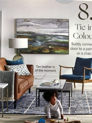
I recently received a brochure from the Hudson’s Bay company and Cognac was certainly a colour that they are inspired by. Check out their images for Fall 2020!
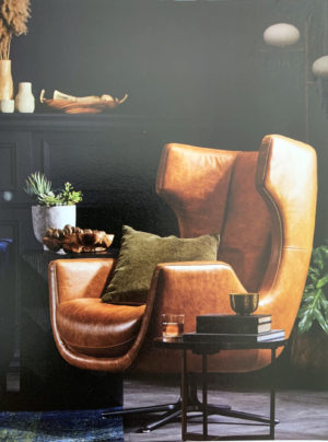
All of their rooms are full of colour, texture, and a bit of edge!. There are lots of neutral-on-neutral colour stories, and you’ll notice how they’re pulling colour and nature into the stories. These rooms looked ‘lived in’.
bustform DRESSING
On Facebook about two weeks ago I showed the following photos seen on IG and I want you to know what I think about them.
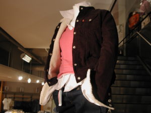
This is a bust form with tissue arms. How many layers are on this one? If you answered 3 on the torso…you are correct!
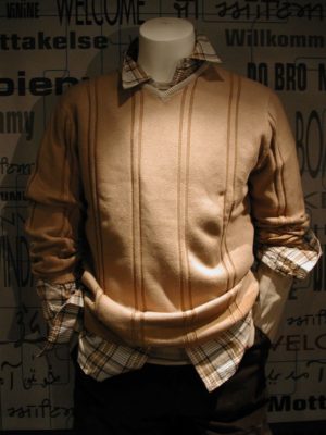
There are three on this one too. Again…tissue arms.
This is certainly adorable, and I love everything about it …EXCEPT the too large hanger on the onesy. It really makes the garment look bad. A smaller hanger would be better.
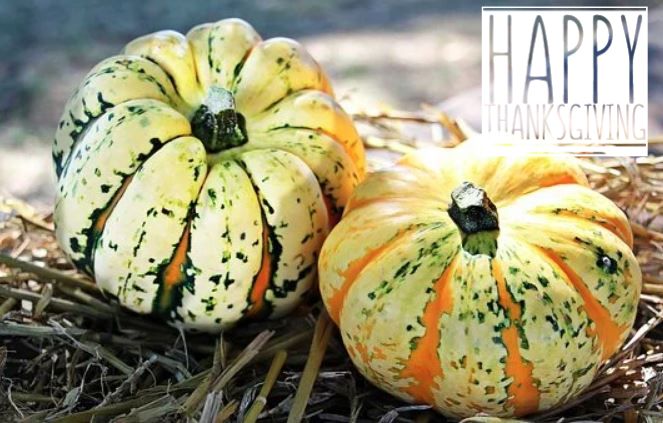
I’ll be enjoying Thanksgiving dinner at my home this year. I think it’s such a privilege to be able to cook for my family. Growing up on a farm in northern Saskatchewan gives me a great appreciation for Harvest Season, and I look forward to seeing my cousins photos on FB, many of whom still are farmers, bringing in the harvest…and the cattle.
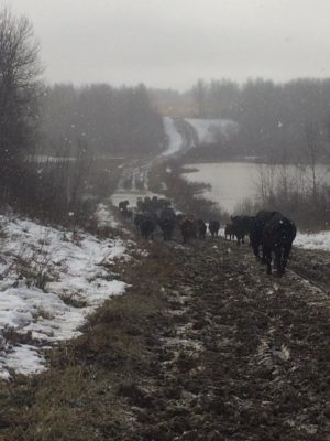
Mid October 2017 Rural Saskatchewan – Photo credit Glen Wilkinson
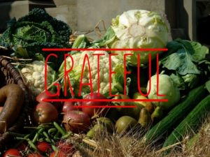
To say that I’m grateful feels like a bit of an understatement. There is so much to be thankful for. Sometimes, we forget to tell people thank you for being in our lives. Today, I will try to make up for all the times I’ve forgotten to say thank you for helping me and being there. You are special and my life is better because of you all.
Recent Comments